CSS Exercises
1. Online Newspaper Design
- Unzip the following file into some folder: news.zip
- You should have now 4 files: index.html (the main page of an online newspaper), item.html (a page representing a single article with comments), register.html and login.html (pages for users to register and login).
- Analyze the structure of these files.
- As you might have noticed, all pages reference 5 css files: style.css (styling the main components), layout.css (positioning the main components), responsive.css (making the page responsive), comments.css (design for the comments section) and register.css (design for the login and register forms).
- Without changing the HTML files, try recreating a design by following these five steps:
1.1 Main Style
We will start by designing the main components of the main page without worrying about the positioning of any elements (style.css). The final result should be this.
Take notice that:
- The green background is not part of the design. The site should occupy the whole width of the browser.
- It's not noticeable on the screenshot, but section links should change their background color to #2A2F33 and their text color to white when the mouse is over them.
Some helper values:
- Main colors used: #2A2F33, #046DD5, and #F4655F.
- Section colors: #E1493E, #8ABA56, #5B4282, #FF8932, #19B6E9 and #E84C8B.
- Fonts used: Lora and Poppins.
- Most paddings and margins are 1em.
@import url('https://fonts.googleapis.com/css?family=Lora:400,700|Poppins:400,700');
What did I learn:
- How to use CSS selectors to select specific parts of an HTML file for styling.
- How to apply basic styling to HTML elements.
- How to import fonts so that we can use more than the web-safe fonts.
- How to use pseudo-classes to select elements based on an element state.
- How to hide elements using CSS.
1.2 Positioning
We will position the elements in their proper places (layout.css). The final result should be this.
Some helper values:
- The background color is #EDEFF0.
- The width of the page is 60em.
- The sidebar occupies 1/5 of the total width.
What did I learn:
- How to use CSS grids to position elements in a webpage.
- How to use CSS flexboxes to position elements in a container.
1.3 Responsive Design
Now we make the design responsive by establishing two breaking points (responsive.css):
- When the width of the window reaches 60em, the sidebar should disappear and the page should occupy the full width (100%) of the window. The final result should be this.
- When the width of the window reaches 30em, the menu should collapse into a pull-down menu, the subtitle should not be shown and each news item title should be moved to above the item image. The final result should be this.
Some helper values:
- Characters for the hamburger menu: \2630 (☰) and \2715 (✕).
What did I learn:
- How to use media queries to specify CSS rules for specific screen widths.
- How to use a hidden checkbox to save state in CSS.
- How to add content to elements using the after pseudo-element.
- How to transitions to create smooth animations in CSS.
1.4 Comments Design
Add CSS rules (comments.css) to create the design for the comment section that can be seen on the item.html page. The final result should be this.
Some helper values:
- Quote character for each comment: \201C (“).
What did I learn:
- How to use grids to design forms.
1.5 Register Design
Add CSS rules (register.css) to create the design for the register and login forms that can be seen in the register.html and login.html pages. The final result should be this.
Make sure that the form fills the content area in smaller screens like this.
What did I learn:
- How to use grids to design forms.
- How to use generic selectors to not repeat myself.
2. No Flexbox/Grid Design
Without using the flexbox and grid CSS layouts, try to recreate some designs.
- Unzip the following file into some folder: blocks.zip.
- Inside the zip you will find an index.html file and a base.css file. These have the structure of the website and some base design. You should not change these files.
- Try to recreate each one of the following designs, without using flexbox or grid, inside the style.css file:
What did I learn:
- How to position, float and clear to create complex CSS designs.
- How much easier it is to use grid and flexbox.
3. Cascading
Consider the following HTML code:
<section id="foo">
  <ul class="bar">
    <li class="first"><a href="#">A</a></li>
    <li class="second"><a href="#">B</a></li>
    <li><a href="#">C</a></li>
    <li><a href="#">D</a></li>
  </ul>
</section>
And the following CSS rules:
section ul li               { color : green }    /*R1*/
.bar .second                { color : red }      /*R2*/
li a                        { color : cyan }     /*R3*/
section li:first-child ~ li { color : yellow }   /*R4*/
#foo .bar li :first-child   { color : inherit }  /*R5*/
.bar li                     { color : magenta }  /*R6*/
3.1 Specificity
- Without using a specificity calculator, calculate the specificity of each rule.
- In the end, verify if you got it right.
3.2 Rules
What rules apply to each of the elements:
- section with id foo:
- ul with class bar:
- each one of the four list items:
- each one of the four links:
3.3 Selected Rule
What is the rule with the highest specificity for each element:
- section with id foo:
- ul with class bar:
- each one of the four list items:
- each one of the four links:
3.4 Color Value
What is the color value (including inherit) assigned to each element:
- section with id foo:
- ul with class bar:
- each one of the four list items:
- each one of the four links:
3.5 Final Color
What is the final color value presented in the browser:
- first link:
- second link:
- third link:
- fourth link:
4. Form
Consider the following HTML code that represents a register form:
<!DOCTYPE html>
<html lang="en-US">
  <head>
    <title>Form Example</title>
    <link rel="stylesheet" href="style.css">
    <link rel="stylesheet" href="responsive.css">
    <meta charset="utf-8">
    <meta name="viewport" content="width=device-width, initial-scale=1.0">
  </head>
  <body>
    <form>
      <label id="username" class="required">
        Username
        <input type="text" name="username" placeholder="johndoe" required>
      </label>
      <label id="password" class="required">
        Password
        <input type="password" name="password" required>
      </label>
      <label id="fname">
        First Name
        <input type="text" name="fname" placeholder="John">
      </label>
      <label id="lname">
        Last Name
        <input type="email" name="lname" placeholder="Doe">
      </label>
      <label id="email" class="required">
        E-mail
        <input type="email" name="email" placeholder="johndoe@mail.com" required>
      </label>
      <label id="address">
        Address
        <input type="text" name="address" placeholder="1st Street, 1">
      </label>
      <label id="country">Country
        <select>
          <option value="pt">Portugal</option>
          <option value="other">Other</option>
        </select>
      </label>
      <label id="city">
        City
        <input type="text" name="city" placeholder="Porto">
      </label>
      <label id="zipcode">
        ZIP Code
        <input type="text" name="zipcode" placeholder="4000-001">
      </label>
      <label id="bio">
        Bio
        <textarea name="bio" placeholder="Just a regular guy..."></textarea>
      </label>
      <button id="register" type="submit">Register</button>
    </form>
  </body>
</html>
4.1 Main Form Design
Try recreating the following design using CSS (style.css):
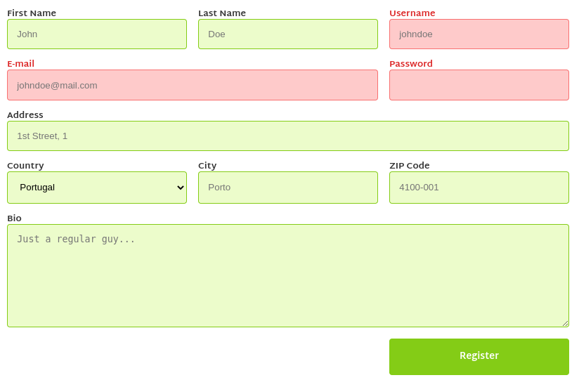
- Use
display: gridon the form to simplify placing each input in the correct place. - Colors used were: #DC2626 for required filed labels, #ECFCCB, #D9F99D, and #84CC16 for inputs, #FECACA and #F87171 for inputs with invalid errors, and #84CC16 for the button background.
- Try using CSS vars to define the colors so they can be easily changed.
- The font used is Martel Sans (normal and bold).
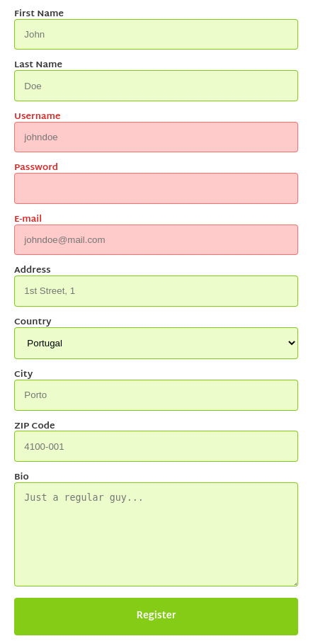
4.2 Responsive Form Design
Add some CSS rules to make the site responsive (responsive.css). The site should look like this in smaller screens:
5. Extra
Let's continue HTML exercise 5. Extra: